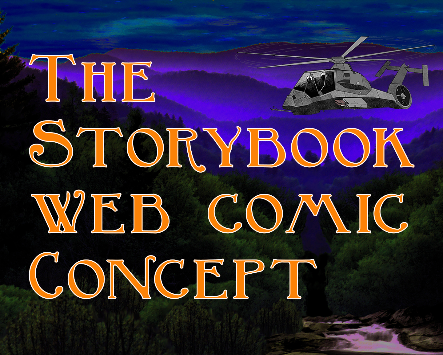
The Storybook Comics Philosophy.
This document is a work in progress.
Let's look at what we mean by the term "web comic" and some concepts for a web comic site design.
There are a wealth of devices being used to view web content. The two things of import there are the device aspect ratio and the overall display size. By aspect ratio we mean portrait mode or landscape mode displays, like a rectangular sheet of ordinary typewriter held vertically or horizontally. When we try to fit a drawing or a page that has one aspect ratio, say landscape, to a display that has another aspect, like portrait, one can readily see that this presents issues in the proper display of the image. For one thing we don't want to stretch the image in one direction and not the other lest we end up with a distorted result. Similarly if we are looking at shrinking the image we want to keep the constraint of aspect ratio in mind.
This Display Data Points document is a collection of data points relative to sheet sizes, page sizes, and screen sizes along with approximate user share percentages and display aspect ratios. The two largest observations here are that displays are largely either tall and not very wide, or they are short and fairly wide. Who knew, right? But besides the obvious, the data can serve to allow us some generalizations. One of these observations is that smaller vertically oriented displays tend to have an aspect ratio between 0.46 and 0.56, which is to say the display is almost twice as tall as it is wide. (Most users are not excited about holding their cellphone horizontally I think.) Meanwhile, virtually all desktop screens have an aspect ratio of 1.78, not quite twice as wide as they are tall. We can shuffle and rearrange content to fit a display, and to a certain extent that is unavoidable. But the reality is that if you want to present images as content it is best that they have the same aspect as the display. So the key here is to answer one question: who is your audience?
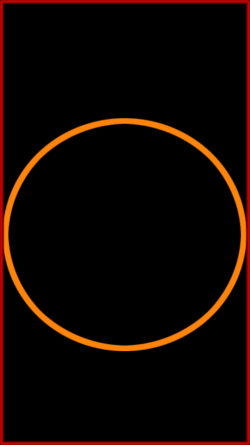
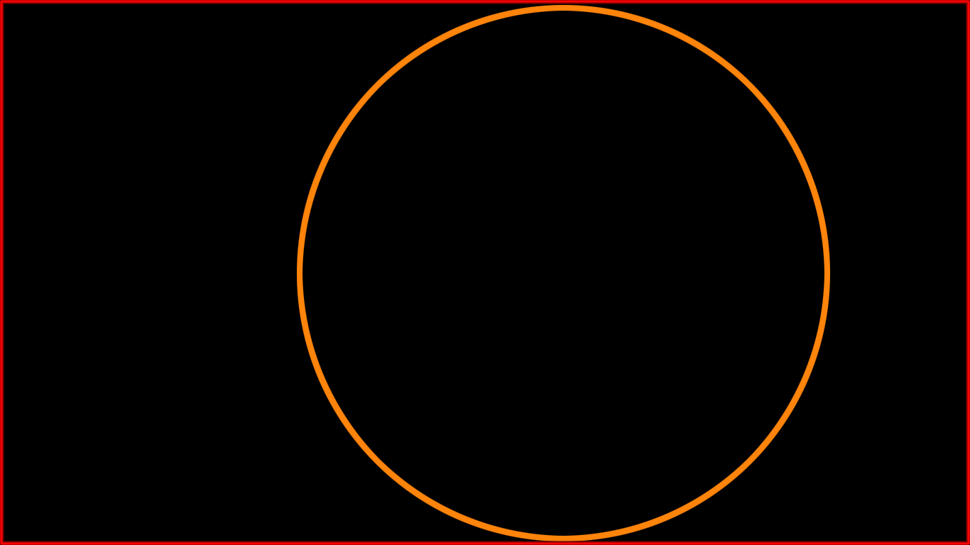
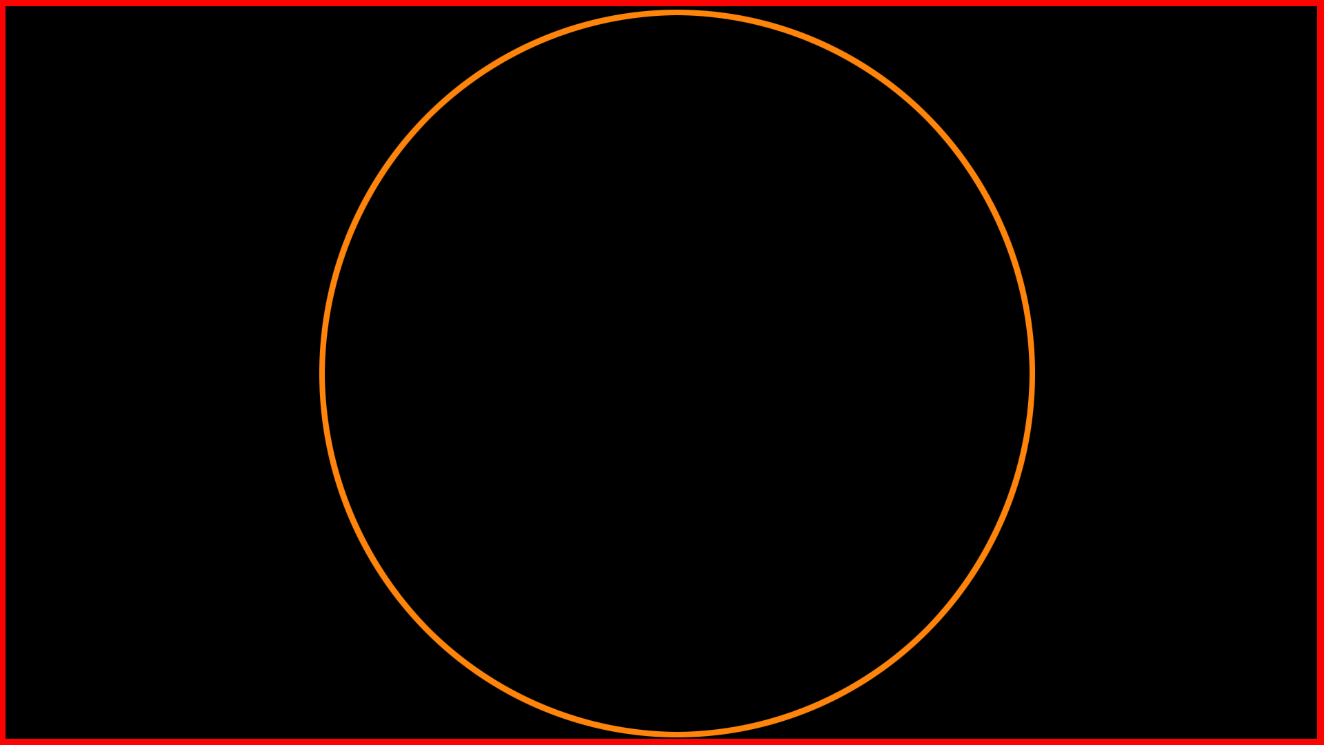
This collection of sample images demonstrates how a display will appear with different sized images and different aspect ratios. You may notice the display at the top left showing the viewport dimensions, or display size, and the aspect ratio of the display. That is not ordinarily shown in the comics. Each comic book image is scaled using the aspect ratio of the display and of the image to optimize the image display without dimensional distortions. These information panels are also not ordinarily displayed in the comics. If you can change the size of your browser window you can see how the images respond and appear on different screen sizes.
Another area to consider is color palette choices, "themes" if you will. Now you have this comic, this image, and certainly the colors in that are your choice entirely. But users want to have choices on things like gutter colors, any dialog or text not part of an image, backgrounds, and so forth. If you look at the demo comic books, there is text content in addition to the graphics, the comic images. I used a kind of muted grey for the background and text boxes (one blue toned the other green toned). Users will get to choose their own scheme. And users will be able to choose a font as well. Many of the palette choices are from Material Design Bootstrap.
We want a clean straightforward UI/UE without extraneous clutter and distractions. If indeed it's a comic books site it should focus on comic books. So the intent is to avoid adware clickbait clutter.
A comic book differs from a graphic novel in terms of length. Within limits there are no plans to limit content length. In fact, at one extreme, you could even go so far as to have a one page comic. But even more, we want to support what I will call illustrated novels or stories. Content that has a good deal of text in addition to some illustrations/images. Along those lines the current plan is to allow Rich Text Format or RTF as input as well as plain text. I will also look at Word or Open Office as input text.
This is all going to be free, anyone can have all the code, and anyone will be able to use the app to make their own comics which they can share or host on the builder site AND download for use elsewhere or share on Facebook.
Display Data Points
A standard US comic book page size is 6.875 by 10.438 inches bleed,
6.625 by 10.187 inches trim, with a live image area of around 6 by 9.5 inches
This results in an aspect ratio of 0.63 (live area) to 0.65 (trim)
Heavy Metal magazine has a trim size of 8 X 10.875 inches,
which is an aspect of 0.74
Print Ninja says traditional "trade" or single issue comic book page size is
6.625 x 10.25 inches, which is an aspect ratio of 0.65
and modern "trade" recommended page size is 6.75 x 10.375 inches,
which is an aspect ratio of 0.65
Common paper sizes
----------------------
8.5x11 has an aspect ratio of 0.77
11x8.5 has a ratio 0f 1.29
9x12 has an aspect ratio of 0.75
12x9 has a ratio of 1.33
11x14 has an aspect ratio of 0.79
14x11 has a ratio of 1.27
Dimensions Share Aspect
--------------------------
all devices
360x640 10.15% 0.56
1366x768 9.4% 1.78
1920x1080 8.39% 1.78
375x667 4.05% 0.56
414x896 3.47% 0.46
1536x864 3.44% 1.78
mobile
360x640 17.63% 0.56
375x667 7.16% 0.56
414x896 6.14% 0.46
360x780 5.7% 0.46
360x760 5.14% 0.47
375x812 4.53% 0.46
desktop
1366x768 23.26% 1.78
1920x1080 20.41% 1.78
1536x864 8.53% 1.78
1440x900 6.98% 1.60
1280x720 4.82% 1.78
1600x900 4.14% 1.78
tablet
768x1024 50.74% 0.75
1280x800 7.42% 1.60
800x1280 5.41% 0.63
601x962 4.63% 0.63
962x601 3.43% 1.60
600x1024 2.9% 0.59
----------------------
Some other stats
1024x768 px 3% 1.333
1280x800 px 11% 1.60
1360x768 px 2% 1.77
1366x768 px 35% 1.78
1440x900 px 6% 1.60
1600x900 px 6% 1.78
1680x1050 px 3% 1.60
1920x1080 px 20% 1.78
2560x1440 px 1% 1.78
Stats from a developer site (Jan 2020)
---------------------
Other 37.5%
1920x1080 20.3% 1.78
1366x768 27.6% 1.78
1280x1024 2.4% 1.25
1280x800 1.8% 1.60
1024x768 1.4% 1.33
Lower 9.0%
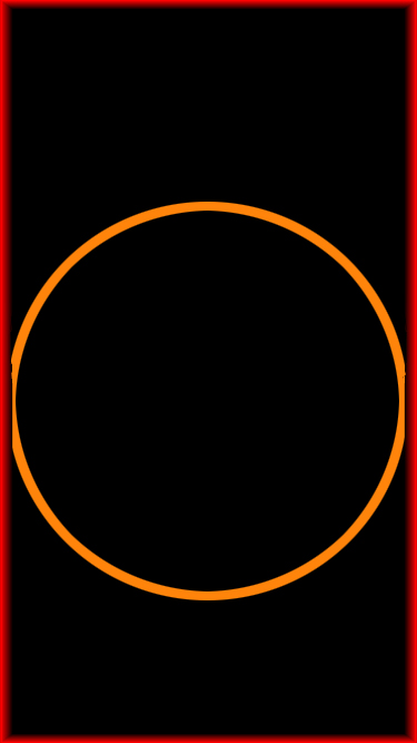
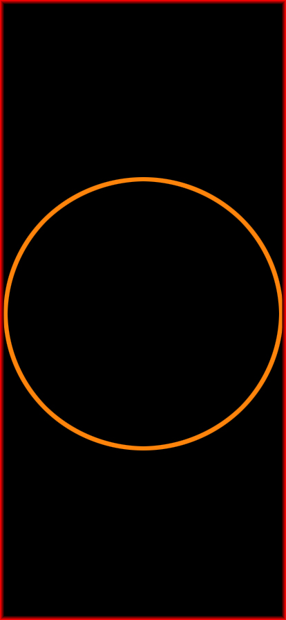
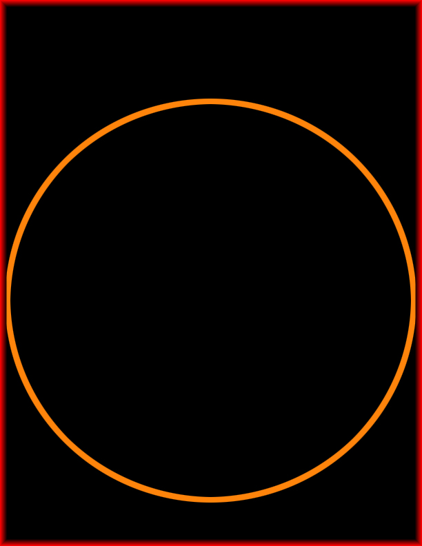
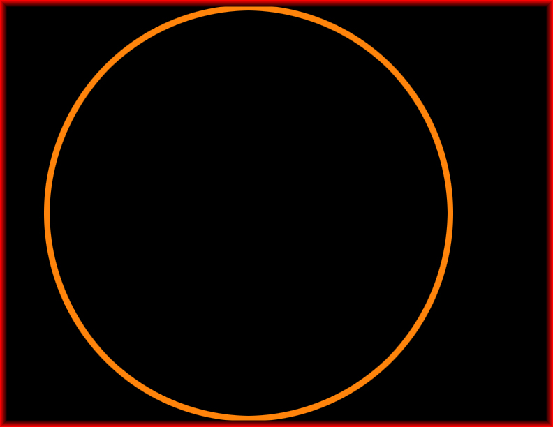
Display Size Examples
These examples can help you decide on the best size and format for your comic art to create inviting, consistent Comic Book designs. In addition to these examples, there is more direct treatment of Image Scaling for web comics at the Image Scaling document.
Color Palette Choices
Using these color scheme choices can help you create inviting, consistent Comic Book designs.
Each color is exposed in various tones varying from bright to dark. They are collated here in sections. Adapted from the Material Design Bootstrap (MDB) Color Palette
Color Spectrum
Choices from this palette may be used as text colors or as background fill colors for items like text panels or caption panels.
danger-color-lite #ef9a9a
danger-color #ff4444
danger-color-dark #CC0000
danger-color-darker #b00808
warning-color-lite #ffcc80
warning-color #ffbb33
warning-color-dark #ff8800
warning-color-darker #e65100
yellow-color-lite #fff59d
yellow-color #ffff00
yellow-color-dark #ffd600
yellow-color-darker #e0a015
success-color-lite #a5d6a7
success-color #00C851
success-color-dark #007E33
success-color-darker #1b5e20
default-color-lite #80cbc4
default-color #2BBBAD
default-color-dark #00695c
default-color-darker #004044
info-color-lite #81d4fa
info-color #33b5e5
info-color-dark #0099CC
info-color-darker #01579b
primary-color-lite #90caf9
primary-color #4285F4
primary-color-dark #0d47a1
primary-color-darker #0027a1
myindigo-color-lite #9fa8da
myindigo-color #536dfe
myindigo-color-dark #304ffe
myindigo-color-darker #1a237e
purple-color-lite #b39ddb
purple-color #7c4dff
purple-color-dark #6200ea
purple-color-darker #311b92
secondary-color-lite #ce93d8
secondary-color #aa66cc
secondary-color-dark #9933CC
secondary-color-darker #4a148c
WHITE
#FFFFFF
GRAY25
#c0c0c0
GRAY50
#808080
BLACK #000000
Text Color Palette
Choices from this palette yield these following text colors.
danger-color-lite-text>
danger-color-text>
danger-color-dark-text>
danger-color-darker-text>
warning-color-lite-text>
warning-color-text>
warning-color-dark-text>
warning-color-darker-text>
yellow-color-lite-text>
yellow-color-text>
yellow-color-dark-text>
yellow-color-darker-text>
success-color-lite-text>
success-color-text>
success-color-dark-text>
success-color-darker-text>
default-color-lite-text>
default-color-text>
default-color-dark-text>
default-color-darker-text>
info-color-lite-text>
info-color-text>
info-color-dark-text>
info-color-darker-text>
primary-color-lite-text>
primary-color-text>
primary-color-dark-text>
primary-color-darker-text>
purple-color-lite-text>
purple-color-text>
purple-color-dark-text>
purple-color-darker-text>
secondary-color-lite-text>
secondary-color-text>
secondary-color-dark-text>
secondary-color-darker-text>
white-background-text>
GRAY25-text>
GRAY50-text>
black-background-text>
MDB Text colors
In addition to the colors shown in the Color Palette, these choices shown here are also available for use as Text colors.
red text.>
pink text.>
purple text.>
deep purple text>
indigo text.>
blue text.>
light blue text.>
cyan text.>
teal text.>
green text.>
light green text.>
lime text.>
yellow text.>
amber text.>
orange text.>
deep orange text.>
brown text.>
gray text.>
blue grey text.>
mdb-color white text>
text-black-50>
text-white-50>
Themes and Gradients Overview
Choices from these theme palettes or from the gradient selections may be used as background fill colors for items like text panels or caption panels.
MDB Dark Theme
elegant-color #2E2E2E
elegant-color-dark #212121
stylish-color #4B515D
stylish-color-dark #3E4551
unique-color #3F729B
unique-color-dark #1C2331
special-color #37474F
special-color-dark #263238
Lite Theme
lite-elegant-color-lite #6E6E6E
lite-elegant-color #4E4E4E
lite-elegant-color-dark #414141
lite-stylish-color-lite #8B919D
lite-stylish-color #6B717D
lite-stylish-color-dark #5E6571
lite-unique-color-lite #7FB2DB
lite-unique-color #5F92BB
lite-unique-color-dark #3C4351
lite-special-color-lite #77878F
lite-special-color #57676F
lite-special-color-dark #465258
Lite Theme R
lite-elegant-color-lite-R #8E6E6E
lite-elegant-color-R #6E4E4E
lite-elegant-color-dark-R #614141
lite-stylish-color-lite-R #AB919D
lite-stylish-color-R #8B717D
lite-stylish-color-dark-R #7E6571
lite-unique-color-lite-R #9FB2DB
lite-unique-color-R #7F92BB
lite-unique-color-dark-R #5C4351
lite-special-color-lite-R #97878F
lite-special-color-R #77676F
lite-special-color-dark-R #665258
Lite Theme G
lite-elegant-color-lite #6E8E6E
lite-elegant-color #4E6E4E
lite-elegant-color-dark #416141
lite-stylish-color-lite-G #8BB19D
lite-stylish-color-G #6B917D
lite-stylish-color-dark-G #5E8571
lite-unique-color-lite-G #7FD2DB
lite-unique-color-G #5FB2BB
lite-unique-color-dark-G #3C6351
lite-special-color-lite-G #77A78F
lite-special-color-G #57876F
lite-special-color-dark-G #467258
Lite Theme B
lite-elegant-color-lite-B #6E6E8E
lite-elegant-color-B #4E4E6E
lite-elegant-color-dark-B #414161
lite-stylish-color-lite-B #8B91BD
lite-stylish-color-B #6B719D
lite-stylish-color-dark-B #5E6591
lite-unique-color-lite-B #7FB2FB
lite-unique-color-B #5F92DB
lite-unique-color-dark-B #3C4371
lite-special-color-lite-B #7787AF
lite-special-color-B #57678F
lite-special-color-dark-B #465278
MDB Gradients
aqua-gradient
purple-gradient
peach-gradient
blue-gradient
Software
These programs and libraries were used to build this site.
Storybook Code Archive
An archive of the code used to build the Storybook site.