Some Aspects of Image Scaling
There are a wealth of devices being used to view web content. The two things of import there are the device aspect ratio and the overall display size. By aspect ratio we mean portrait mode or landscape mode displays, like a rectangular sheet of ordinary typewriter paper held vertically or horizontally. When we try to fit a drawing or a page that has one aspect ratio, say landscape, to a display that has another aspect, like portrait, one can readily see that this presents issues in the proper display of the image. For one thing we don't want to stretch the image in one direction and not the other lest we end up with a distorted result. Similarly if we are looking at shrinking the image we want to keep the constraint of aspect ratio in mind.
If you can resize your browser window these screens should respond to the change so you may experiment with the appearance of these images. The image above has a square aspect, the original is at 1080x1080 pixels. It should appear as square on your display.
We won't be doing any real math intensive analysis, it simply isn't necessary.
A quick review of some dimensions and aspect ratios.
----------------------
A square image has an aspect of 1
----------------------
standard US comic book page size:
6.875 by 10.438 inches bleed,
6.625 by 10.187 inches trim,
live image area 6 by 9.5 inches
This results in an aspect ratio of 0.63 (live area) to 0.65 (trim)
----------------------
9x12 paper has an aspect ratio of 0.75
12x9 paper has a ratio of 1.33
----------------------
Our Example Display Dimensions and Aspect Ratios
360x640 0.56
1920x1080 1.78
1280x800 1.60
800x1280 0.63
Notice that the US comic live area and an 800x1280 display have essentially the same aspect ratio!
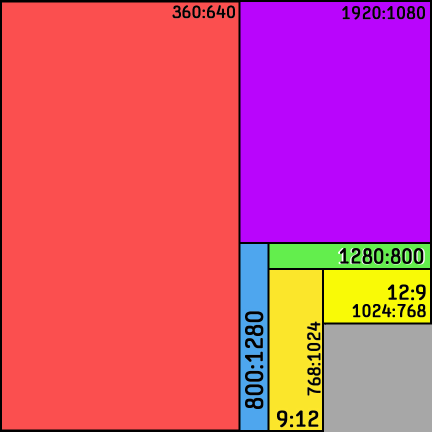
Let's look at the idea of a unit square to compare different device aspect ratios. If we scale several portrait and several landscape display ratios to the unit square we can see how they compare to each other more easily. In this image above we have overlaid or stacked the various display sizes and aspect ratios on such a unit square. The object is to minimize the number of different aspect ratio images we have to create and serve. First let's look at using two source images, one for landscape and another for portrait devices, and let's use an original with an aspect ratio that is more or less middling across most devices with the same orientation. In the following discussion we look at a face drawing example followed by an asteroid hanging in space example as our originals. The face image and the asteroid image in each of the two formats, portarit or landscape, are the same size originally.
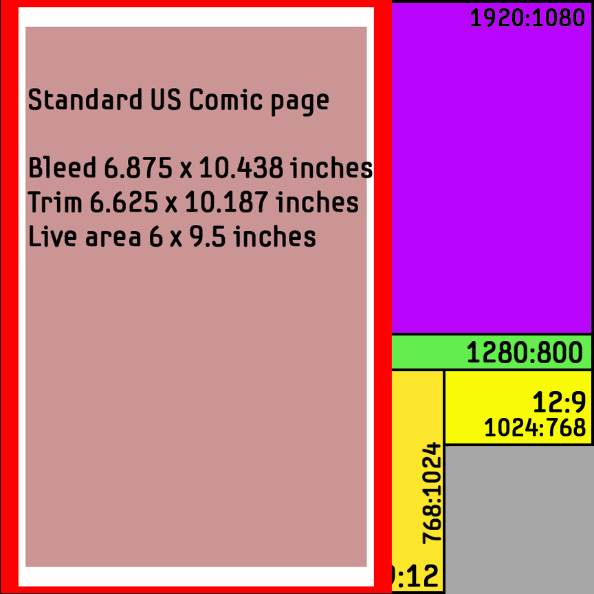
Since the subject is comics, let's take a quick look at how a standard US comics page aspect compares with the displays in our unit square. In this image above, a precut comic page is placed on the unit square to better inform us about the next two images.
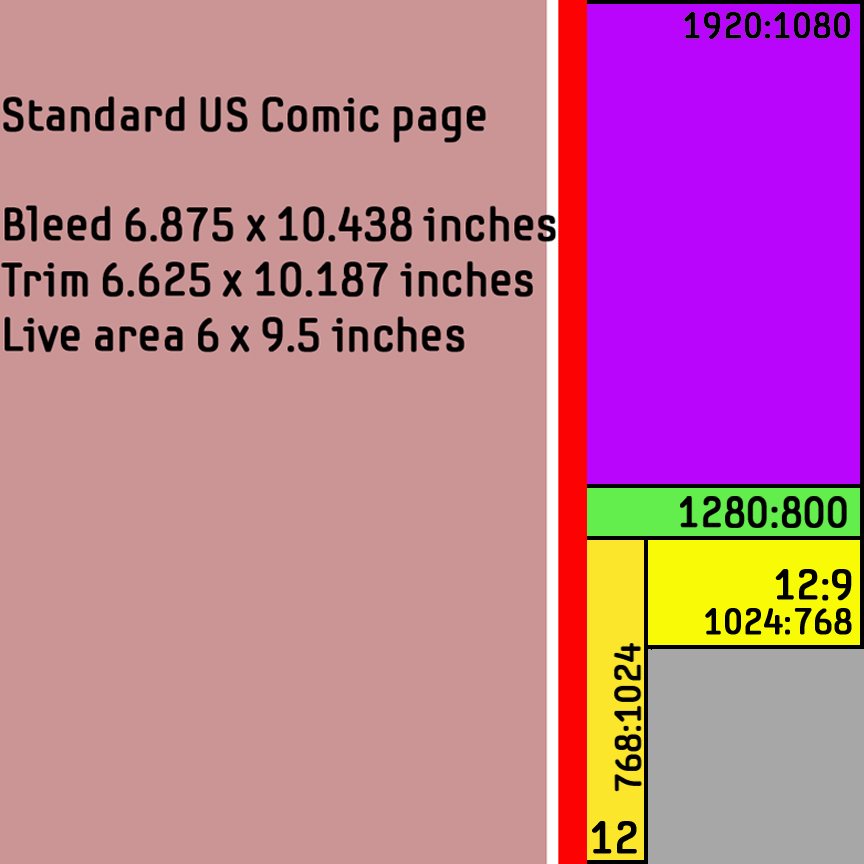
In this image above, we have scaled the "live" area of the standard US comic page to the unit square. In most instances we would like the "live area" of our images to relatively fill the screen edge to edge and so are less concerned about bleed and trim dimensions.
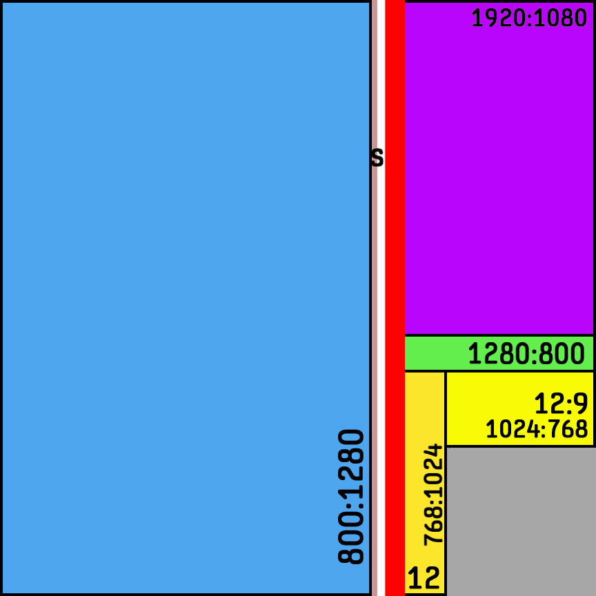
Finally in this image above, we have scaled the "live" area of the standard US comic page to the unit square and changed the order of the overlays. Doing this we can see that the aspect ratio of a US comics page live area is very close to the 800x1280 aspect display. If for some reason you wanted a landscape page display, obviously a 1280x800 display would be very close to the US comic aspect ratio held horizontally.
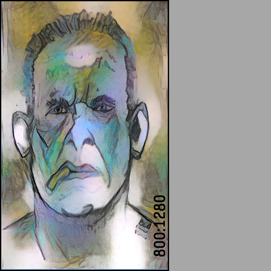
In the image above we have an image that was originally made at 800x1280 pixels being displayed on an 800x1280 pixel display which is in turn overlaid on the unit square. The image having the same proportions as the display, we assume this image has minimum distortion.
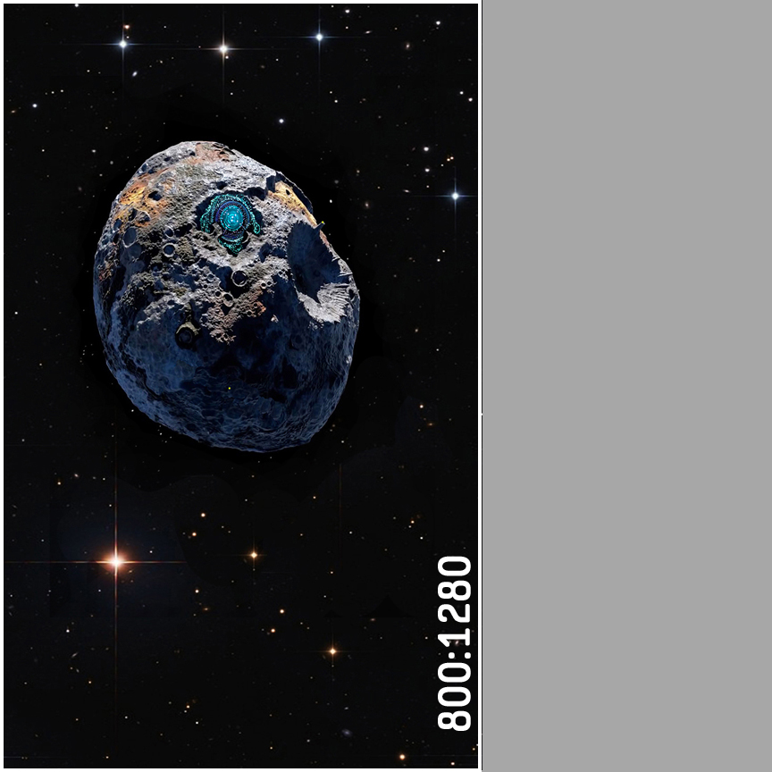
In the image above we have an image that was originally made at 800x1280 pixels being displayed on an 800x1280 pixel display which is in turn overlaid on the unit square in identical fashion to the face image. The image having the same proportions as the display, we again assume this image has minimum distortion.
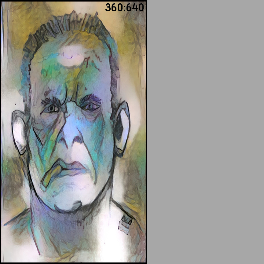
In the next image shown above, we have scaled the original 800x1280 ratio to a 360x640 ratio to suit a display with that aspect ratio. We can see a small amount of dimensional distortion but the images "look" very similar.
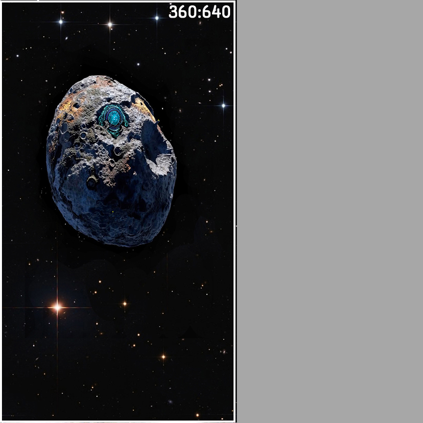
In the image shown above, we have scaled the original 800x1280 ratio to a 360x640 ratio to suit a display with that aspect ratio. Here again we can see a small amount of dimensional distortion but the images "look" very similar.
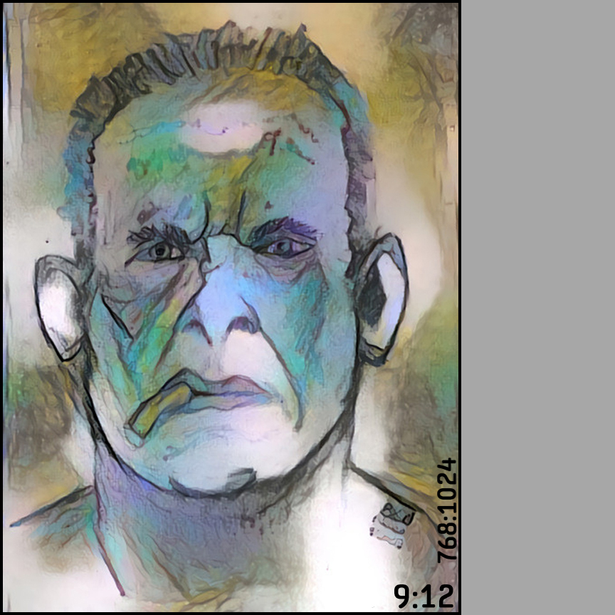
In the next image shown above, we have scaled the original 800x1280 ratio to a 9x12 or 768x1024 ratio to suit a display with that aspect ratio or a sheet of drawing paper. Again, you can see a small amount of dimensional distortion, but again the images "look" similar albeit with more distortion than the two previous examples.
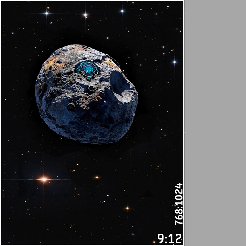
In the next image shown above, we have scaled the original 800x1280 ratio to a 9x12 or 768x1024 ratio to suit a display with that aspect ratio or a sheet of drawing paper. Again, you can see a small amount of dimensional distortion, but again the images "look" similar albeit with more distortion than the two previous examples.
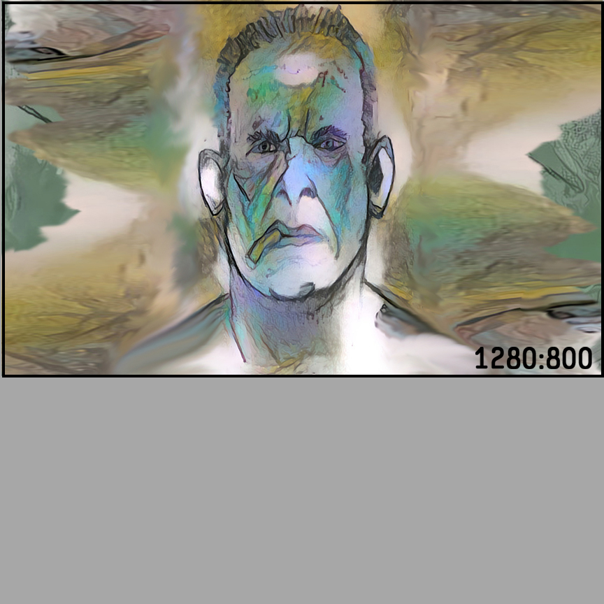
In the image above we have an image that was originally made at 1280x800 pixels being displayed on an 1280x800 pixel display which is in turn overlaid on the unit square. The image having the same proportions as the display, we assume this image has minimum distortion.
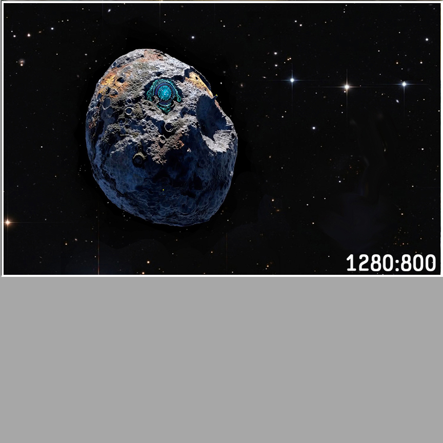
In the image above we have an image that was originally made at 1280x800 pixels being displayed on an 1280x800 pixel display which is in turn overlaid on the unit square. The image having the same proportions as the display, we assume this image has minimum distortion.
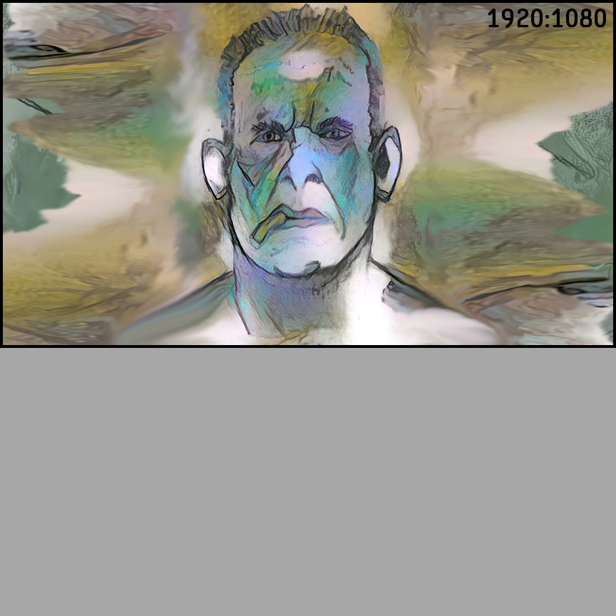
In the next image shown above, we have scaled the original 1280x800 ratio to a 1920x1080 ratio to suit a display with that aspect ratio. You can see a small amount of dimensional distortion but the images "look" very similar.
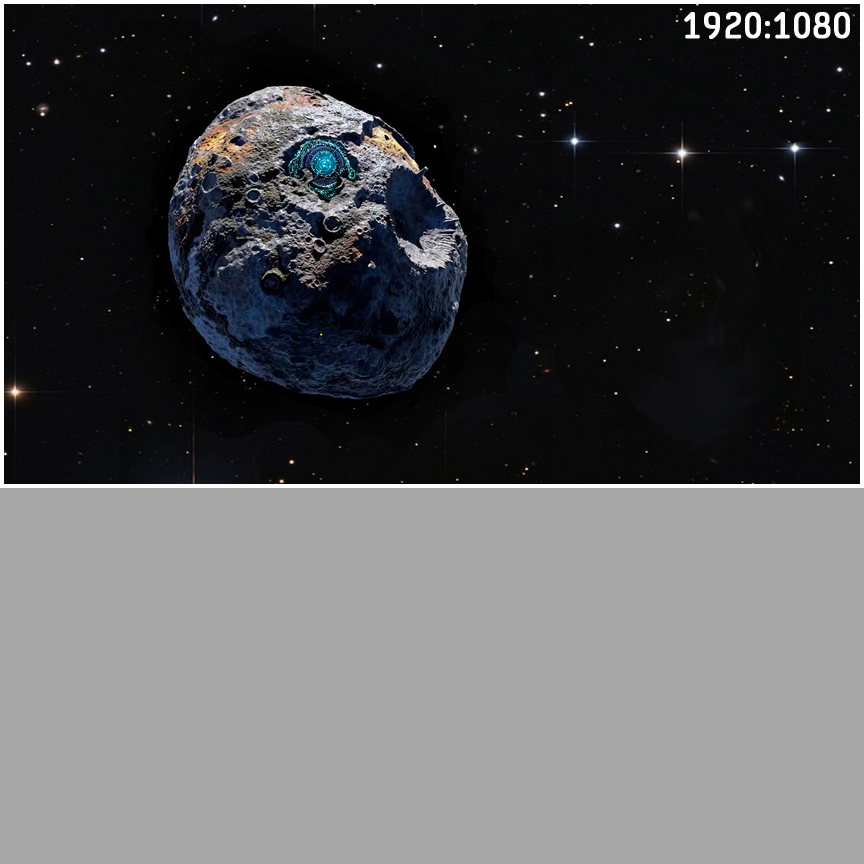
In the next image shown above, we have scaled the original 1280x800 ratio to a 1920x1080 ratio to suit a display with that aspect ratio. You can see a small amount of dimensional distortion but the images "look" very similar.
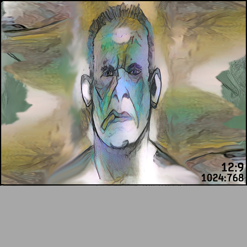
In the next image shown above, we have scaled the original 1280x800 ratio to a 12x9 or 1024x768 ratio to suit a display with that aspect ratio, or a sheet of drawing paper. Again, you can see a small amount of dimensional distortion, but again the images "look" similar albeit with more distortion than the two previous examples.
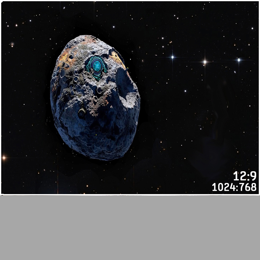
In the next image shown above, we have scaled the original 1280x800 ratio to a 12x9 or 1024x768 ratio to suit a display with that aspect ratio, or a sheet of drawing paper. Again, you can see a small amount of dimensional distortion, but again the images "look" similar albeit with more distortion than the two previous examples.
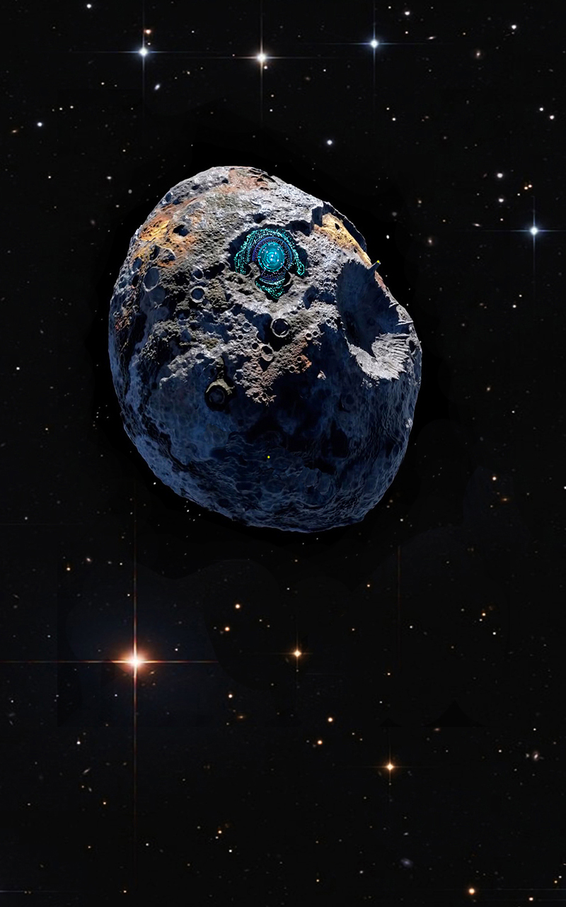
The image shown above is the original "asteroid" image at 800x1280 pixels without the unit square. On this site we have contrived to scale image content to fill the display being used while keeping the original image aspect ratio, so on a lanscape format display this image will appear in the center of the screen at the display height. On a portrait format display it will likely nearly fill the screen.
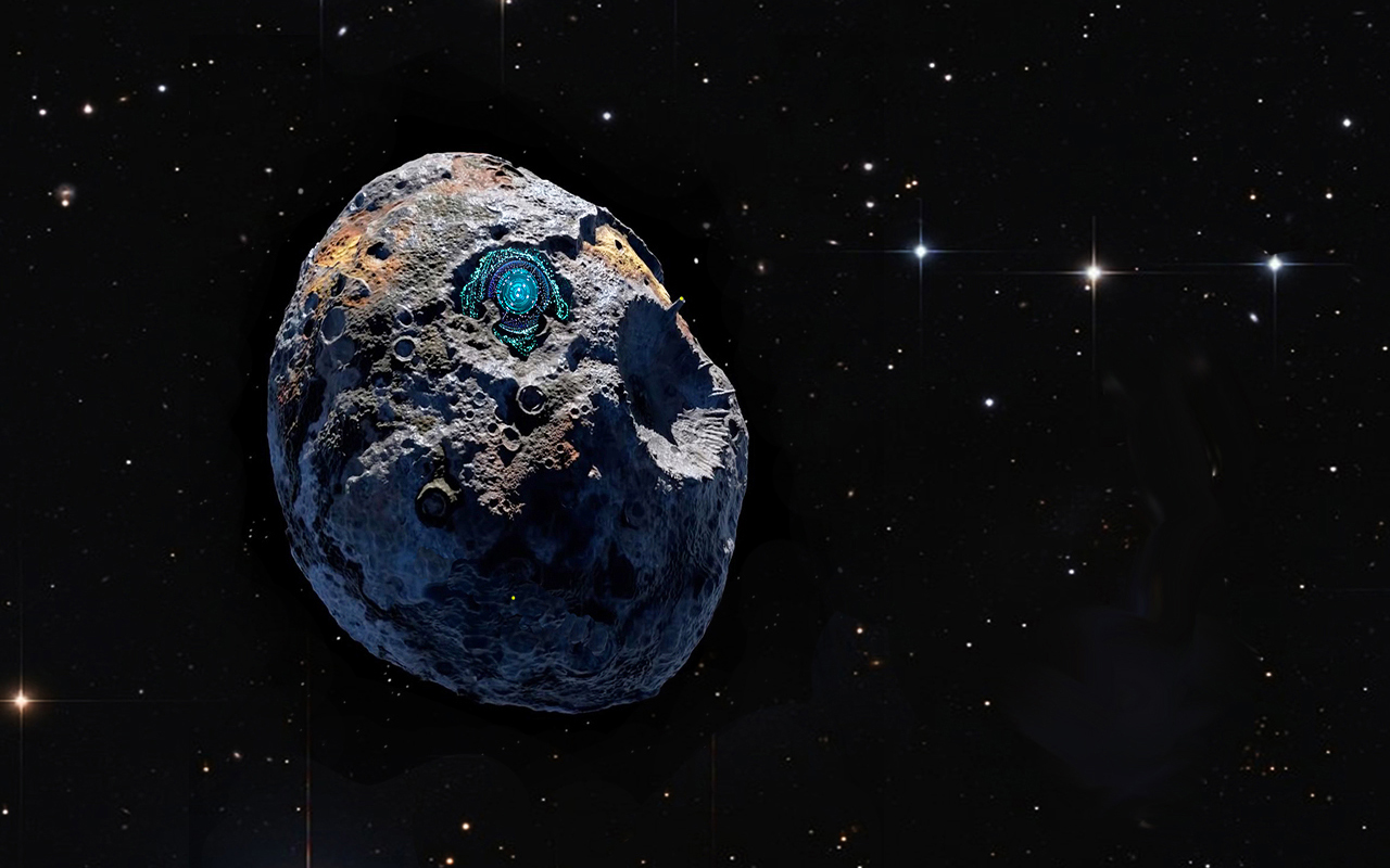
The image shown above is the original "asteroid" image at 1280x800 pixels without the unit square. As stated previously, on this site we have contrived to scale image content to fill the display being used while keeping the original image aspect ratio, so on a portrait format display this image will appear in the center of the screen at the display width. On a landscape format display it will likely nearly fill the screen.
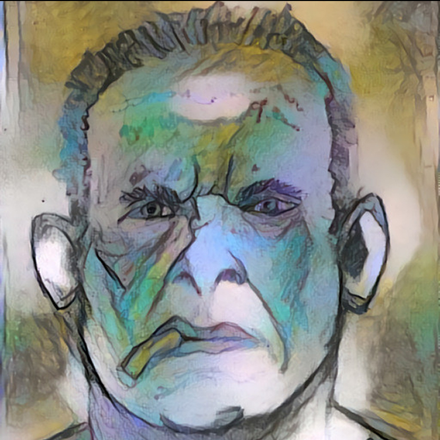
We can see that portrait aspect originals that nominally reflect portrait display ratios yield fairly decent results when scaled across portrait devices. Good results also occur when landscape aspect originals are shown on landscape displays with similar aspect ratios. But let's take a look at another approach that might also be considered with the aim to require only one piece of original artwork while yielding acceptable results across both portrait AND landscape displays with the same base image. We began the discussion with the idea of a unit square for comparison purposes. This image is square in aspect. Let's see how square images scale across the same displays.
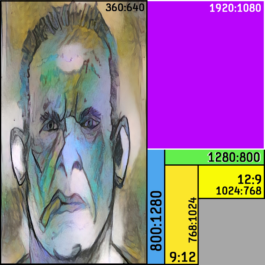
In the image shown above, we have scaled a square image to a 360x640 ratio to suit a display with that aspect ratio. We can see dimensional distortion but the original square image and the display aspect "look" similar. It is up to the content creator to consider the trade offs with this appraoch.
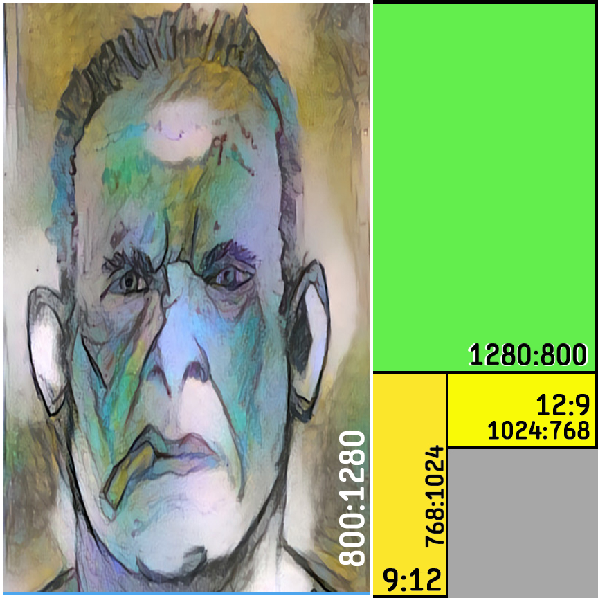
In the image shown above, we have scaled a square image to a 800x1200 ratio to suit a display with that aspect ratio. Once again, we can see dimensional distortion but the original square image and the display aspect still "look" similar. And once again, it is up to the content creator to consider the trade offs with this appraoch.
.jpg)
In the image above, we have scaled the original square image ratio to a 9x12 or 768x1024 ratio to suit a display with that aspect ratio, or a sheet of drawing paper. Again, you can see dimensional distortion, but again the images "look" similar albeit with less distortion than the two previous examples.
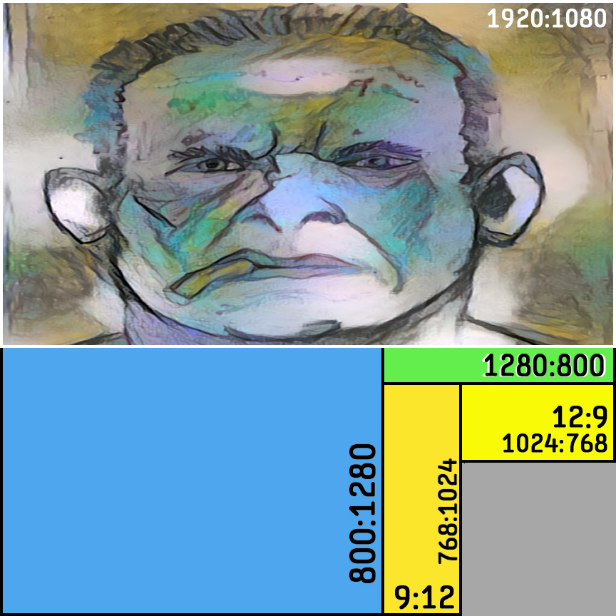
In the image shown above, we have scaled a square image to a 1920X1080 ratio to suit a display with that aspect ratio. We can see dimensional distortion but the original square image and the display aspect "look" similar. It is up to the content creator to consider the trade offs with this appraoch.
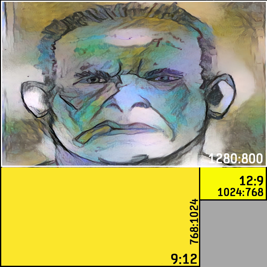
In the image shown above, we have scaled a square image to a 1280x800 ratio to suit a display with that aspect ratio. Once again, we can see dimensional distortion but the original square image and the display aspect still "look" similar. And once again, it is up to the content creator to consider the trade offs with this appraoch.
.jpg)
In the image above, we have scaled the original square image ratio to a 12x9 or 1024x768 ratio to suit a display with that aspect ratio, or a sheet of drawing paper. Again, you can see dimensional distortion, but again the images "look" similar albeit with less distortion than the two previous examples.
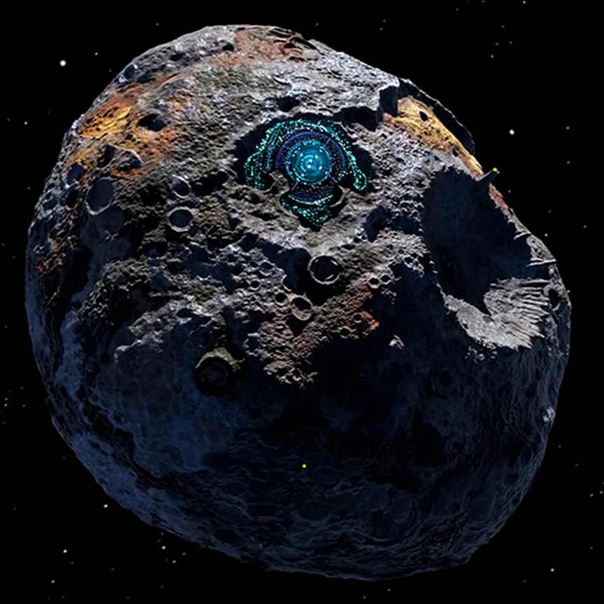
Now, in these next three portrait display examples and next three landscape display examples we are going to look at an image that is less amenable to such scaling. This time we will again use a square original image aspect ratio, the asteroid shown here above. In particular, observe that the asteroid is fairly near to being round or circular, it is not an ellipse.
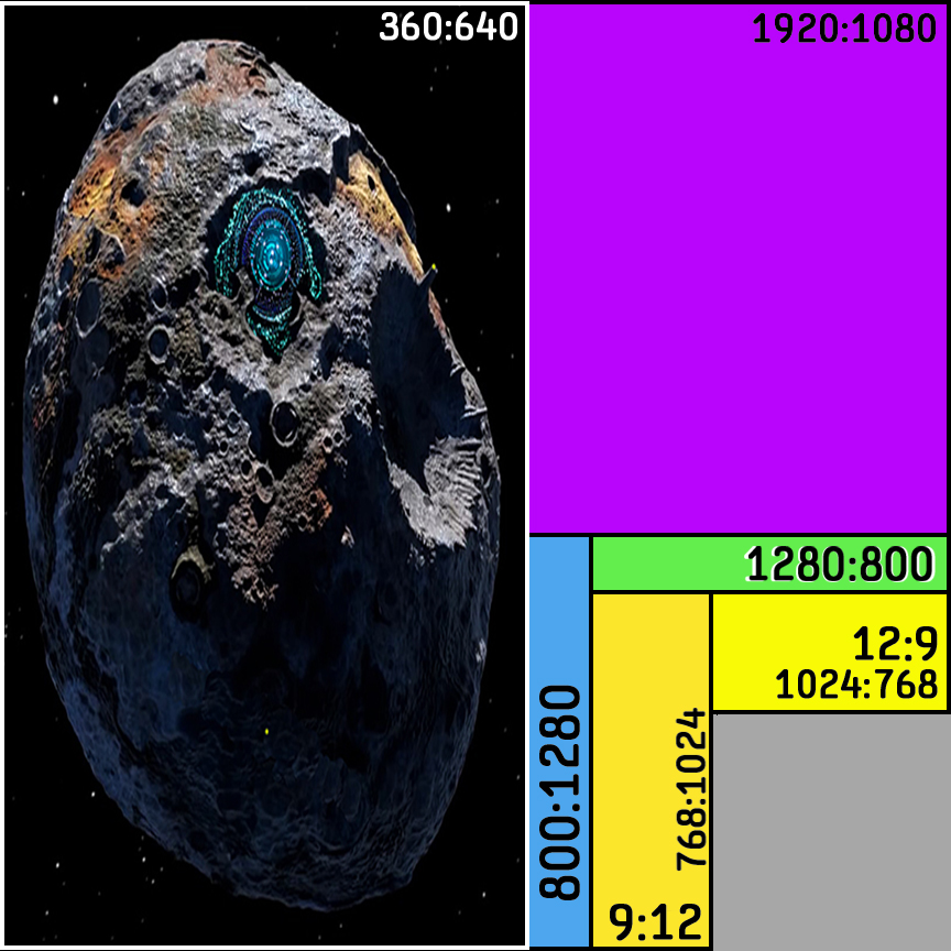
In the image above we have an image that was originally square being displayed on an 360x640 pixel display which is in turn overlaid on the unit square in identical fashion to the face image. The vertical distortion is quite noticeable, and likely unacceptable. Recall that the face didn't appear so profoundly "stretched". Our round asteroid has become an ellipse.
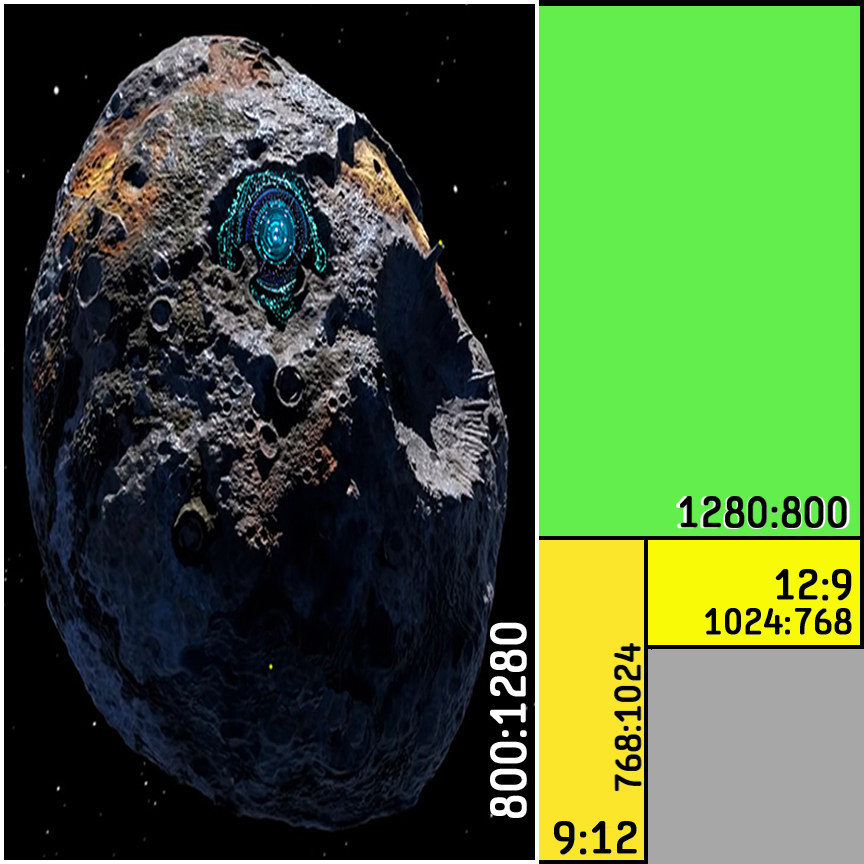
In the image above we have an image that was originally square being displayed on an 800x1280 pixel display which is in turn overlaid on the unit square in identical fashion to the face image. The vertical distortion is quite noticeable, and likely unacceptable. Once again, our round asteroid has become an ellipse.
.jpg)
In the image shown above, we have scaled the original square ratio to a 9x12 or 768x1024 ratio to suit a display with that aspect ratio or a sheet of drawing paper. Again, you can see a good bit of dimensional distortion, albeit with slightly less distortion than the two previous examples.
Next let's look at three landscape apect examples using the square original.
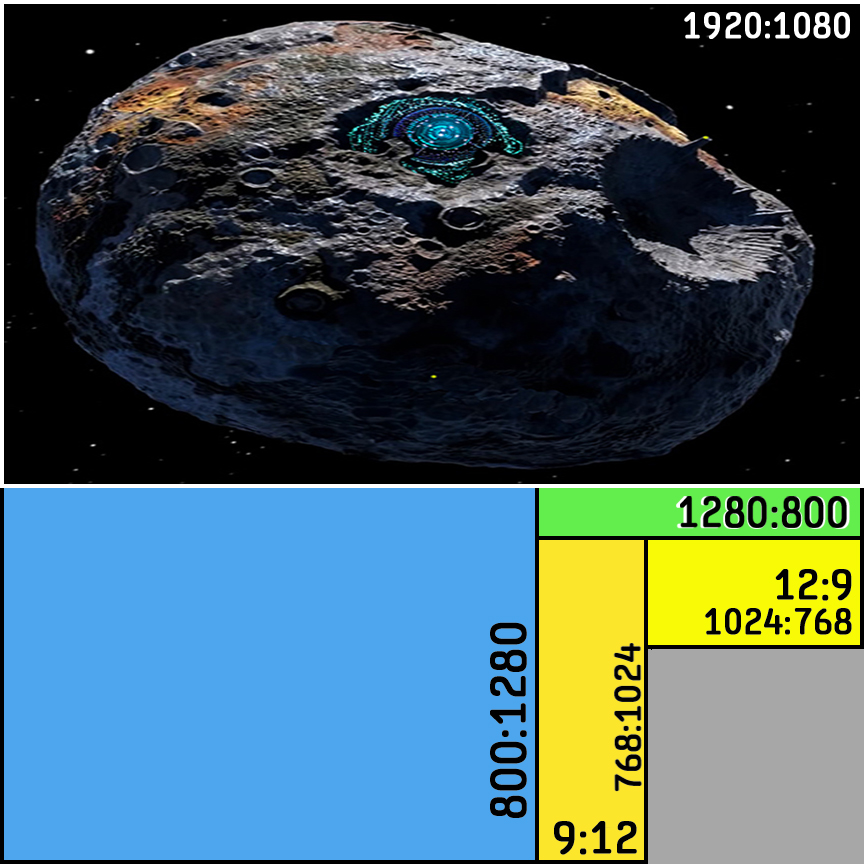
In the image shown above, we have scaled the original square image ratio to a 1920x1080 ratio to suit a display with that aspect ratio. We can see a large amount of dimensional distortion, our asteroid has become an egg.
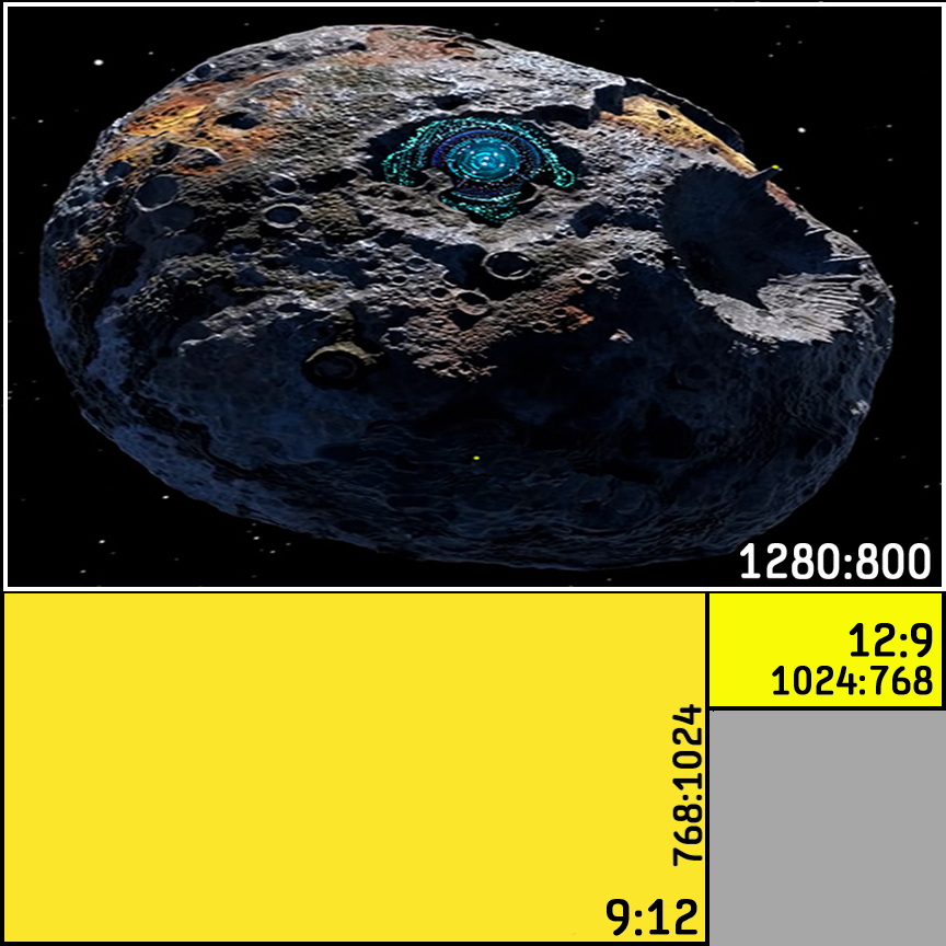
In the image shown above, we have scaled the original square image ratio to a 1280x800 ratio to suit a display with that aspect ratio. We can see a large amount of dimensional distortion, our asteroid has once again become an egg.
.jpg)
In the image shown above, we have scaled the original square ratio to a 9x12 or 768x1024 ratio to suit a display with that aspect ratio or a sheet of drawing paper. Again, you can see a good bit of dimensional distortion, albeit with slightly less distortion than the two previous examples.
So there is a take-home from this.
If you want to address both portrait and landscape displays and you want the best looking content you can obtain on both formats, you really need to use two different aspect source or original images. You can get good results by using an 800x1280 rato or standard US comic page live area in the normal portrait mode and then another image turned horizontally, or 1280x800 in ratio.
For some image content you may be able to compromise the amount of drawing work by using a square format image, but in many cases that will prove unacceptable. Certainly there are trade offs to consider with any use of square originals to address both aspect formats; how much dimensional distortion is acceptable.
But wait! Can't cell phones and tablets be turned to use either landscape or portrait display formats? Yes that is correct, but if you pursue that avenue it seems that you may be fighting hard to defeat habits. In general people just don't hold the phone horizontally. (Use as a camera seems an occasional exception to that general rule.) However, having said that, it may be easier to get a cell phone user to rotate their device than to get say a laptop or desktop user to rotate their display. Frankly some content might be better in one aspect or the other.
Based upon the number of Internet users and devices, how many of what kind, the cellphone is the most common device, and they are pretty much all classified by the dimensions of their portrait aspect ratio. If I were going to select only one image format and aspect ratio based on that data, the percentage of devices, I would choose portrait mode with an image of 800x1280 aspect ratio. Given the option or requirement to have artwork in both portrait and landscape aspects, I would add 1280x800 proportioned images.
As a comics artist I might have the temerity to do the artwork in landscape mode and ask cellphone users to turn their device.
Let's close the discussion with a quick glance at a number of various sized images to give some idea about how they might appear as part of a web comic. Again, if you can adjust your browser window size you can see how the same image might look on different displays.
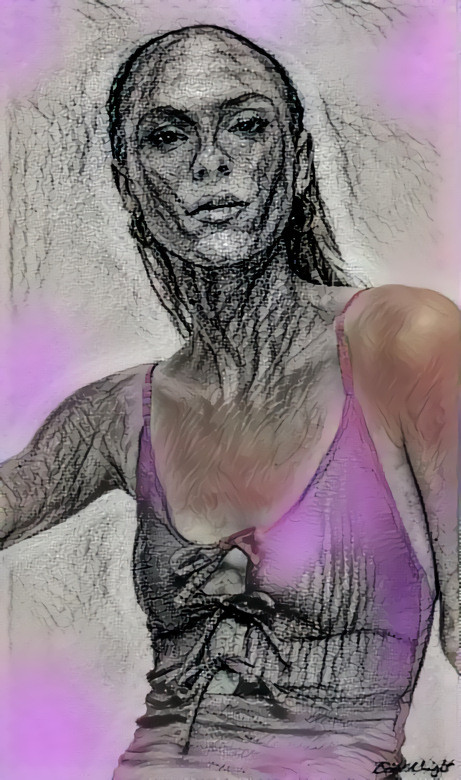
This image is originally 461 x 780 pixels.
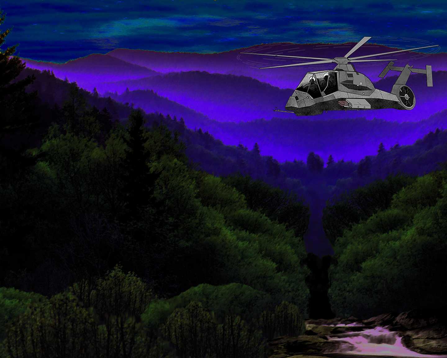
This image is originally 1440 x 1152 pixels.
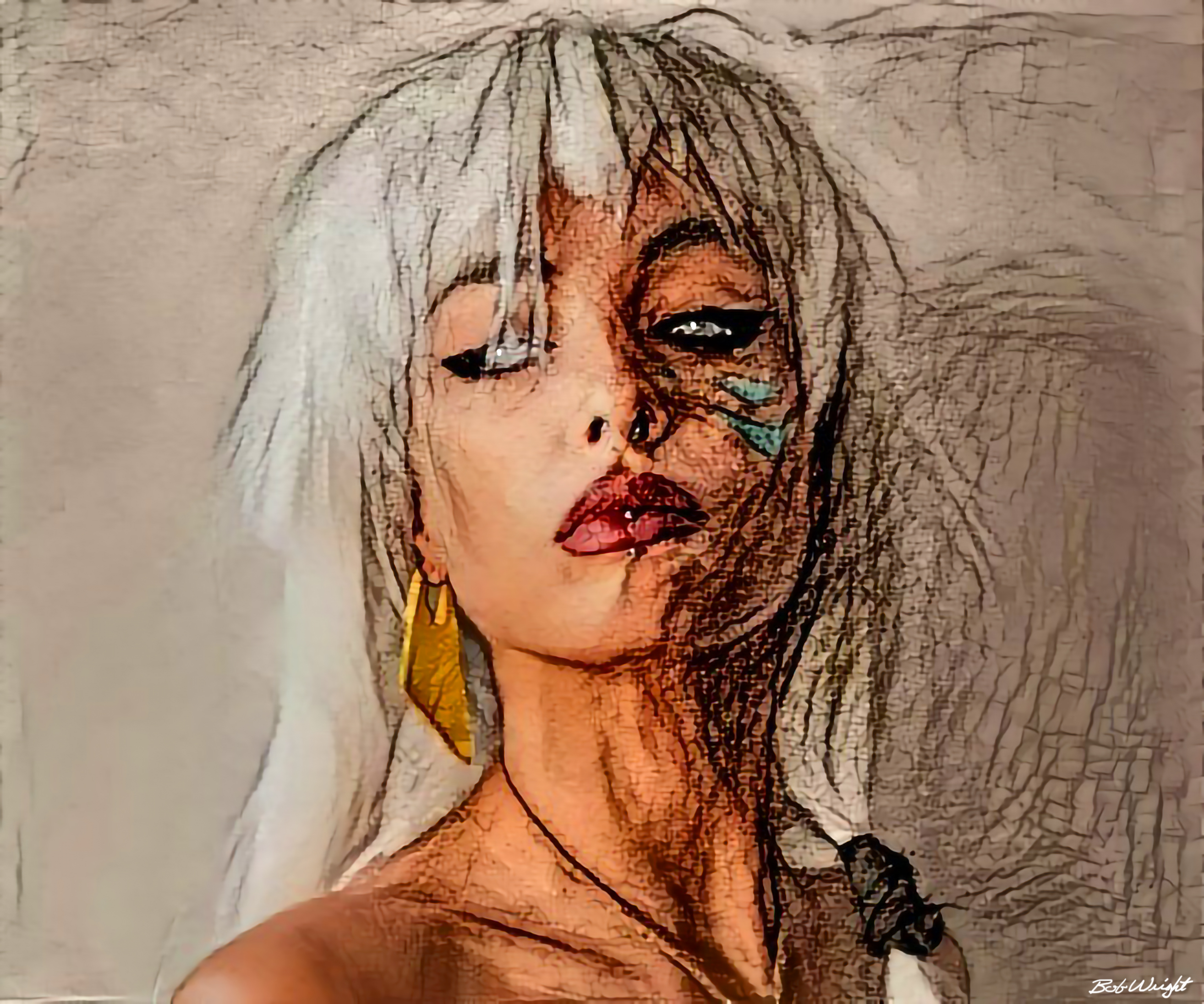
This image is originally 2628 x 1152 pixels.
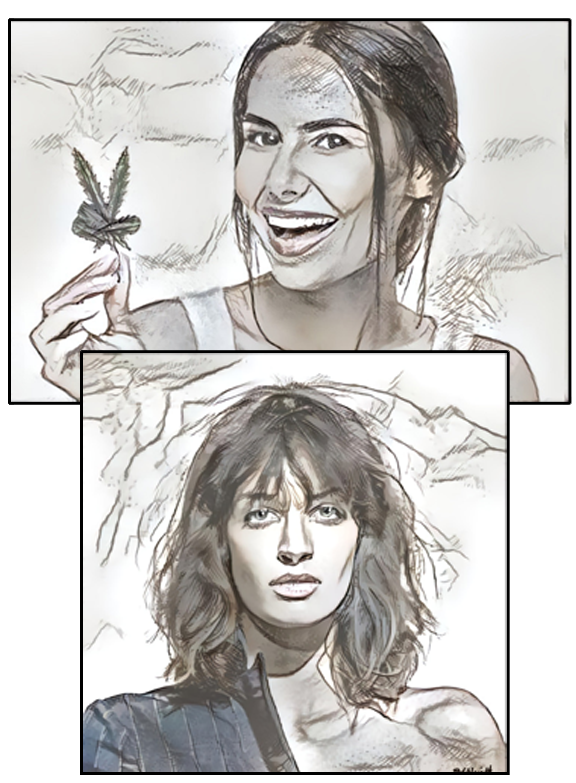
This image is originally 576 x 763 pixels. This image is a PNG to allow for panels within the page frame.
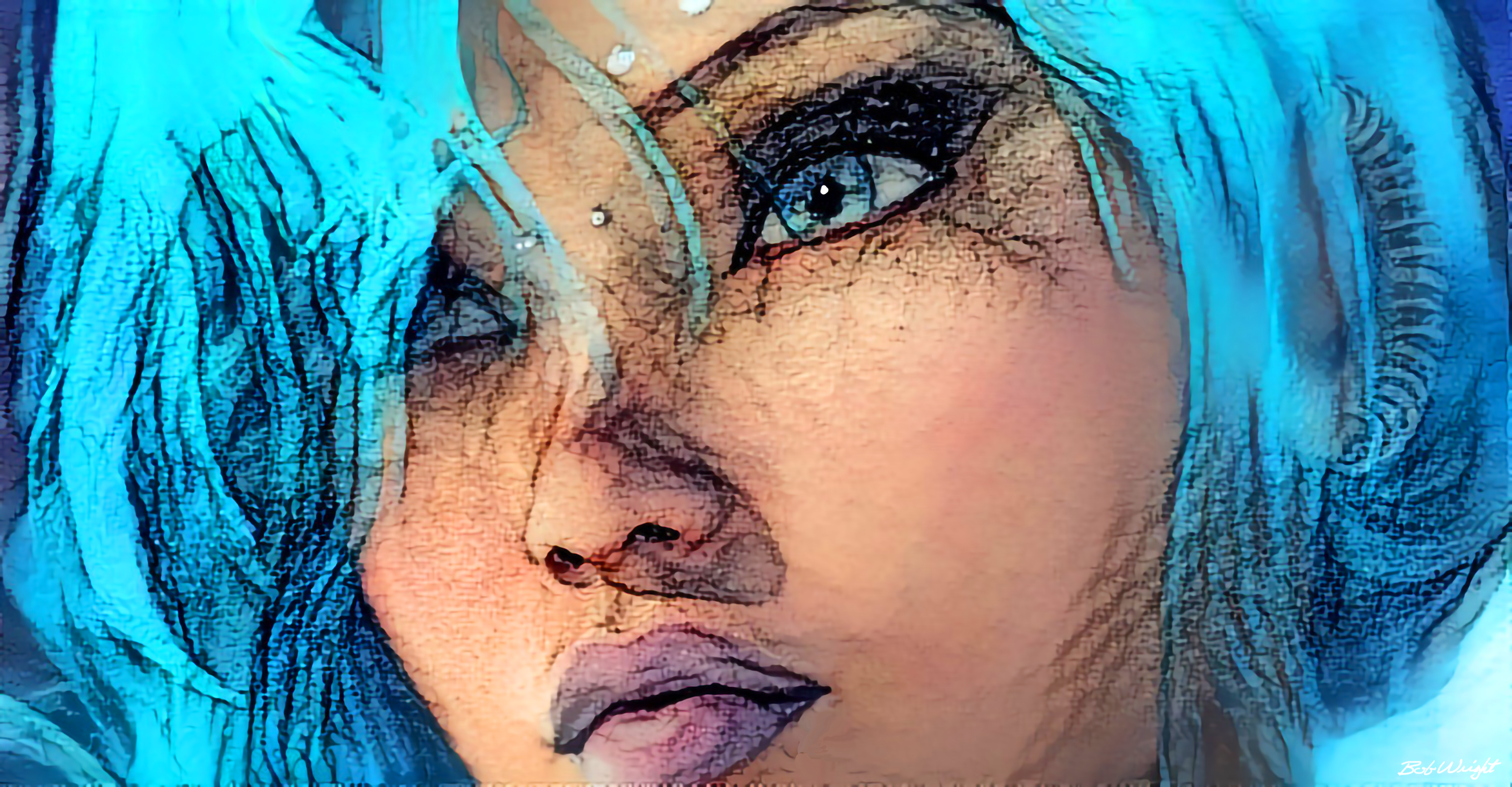
This image is originally 3328 x 2192 pixels.
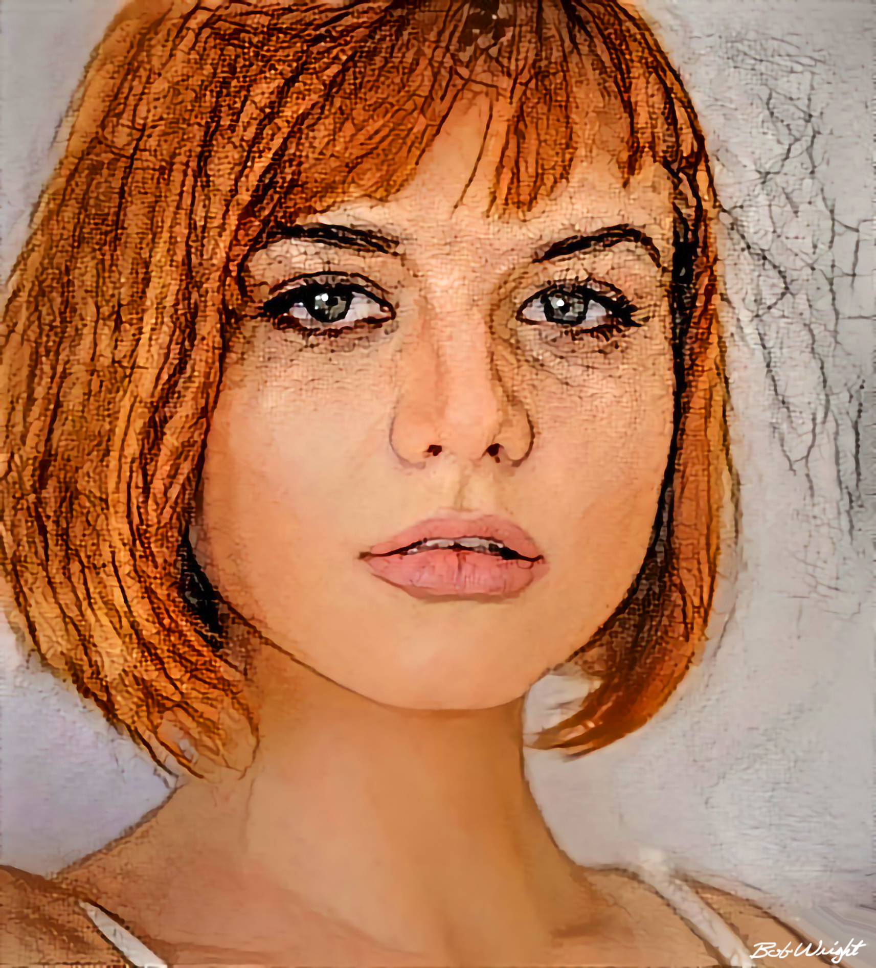
This image is originally 1713 x 1893 pixels.
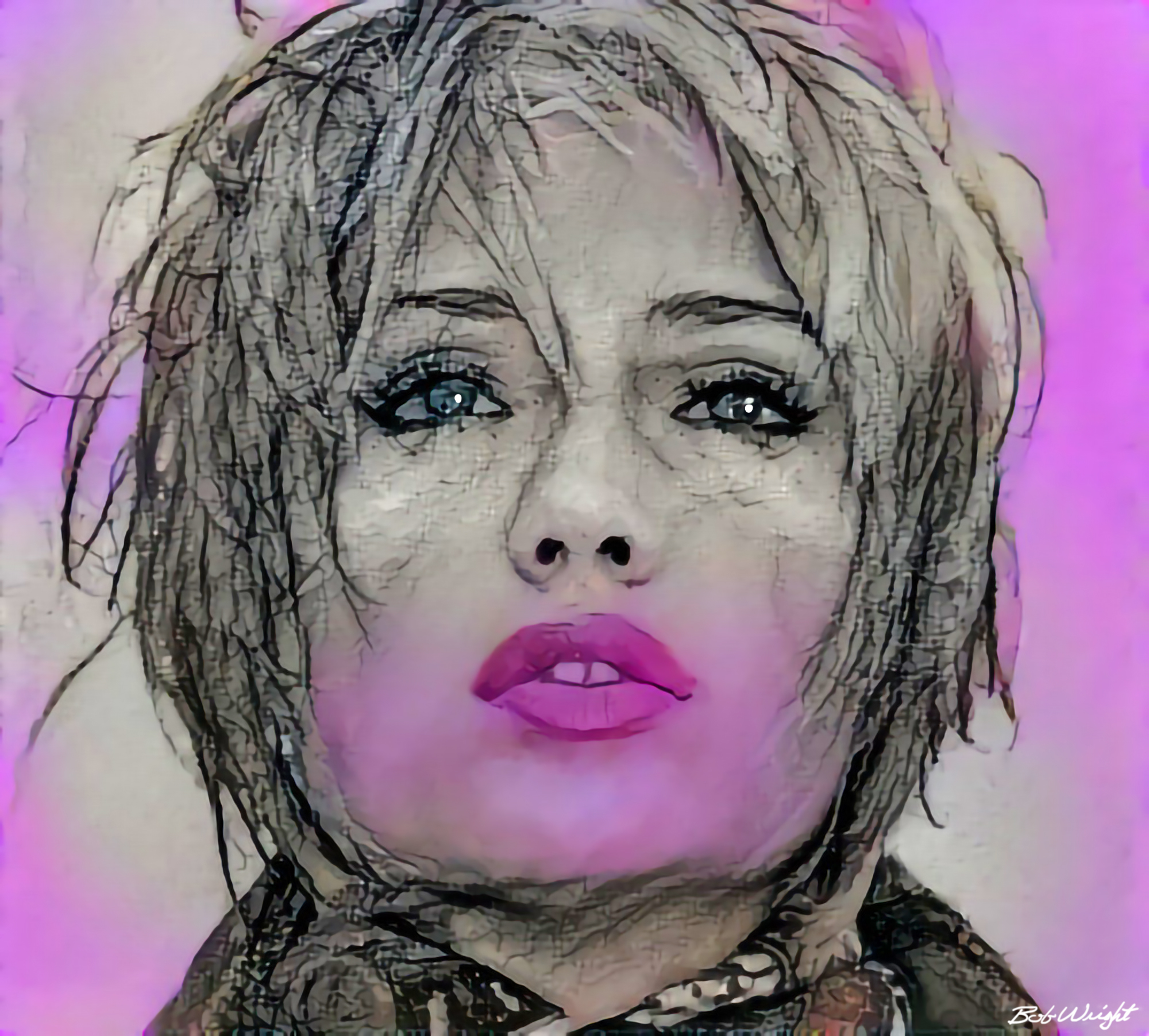
This image is originally 2000 x 1804 pixels.
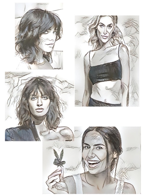
This image is originally 576 x 763 pixels. This image is a PNG to allow for panels within the page frame.
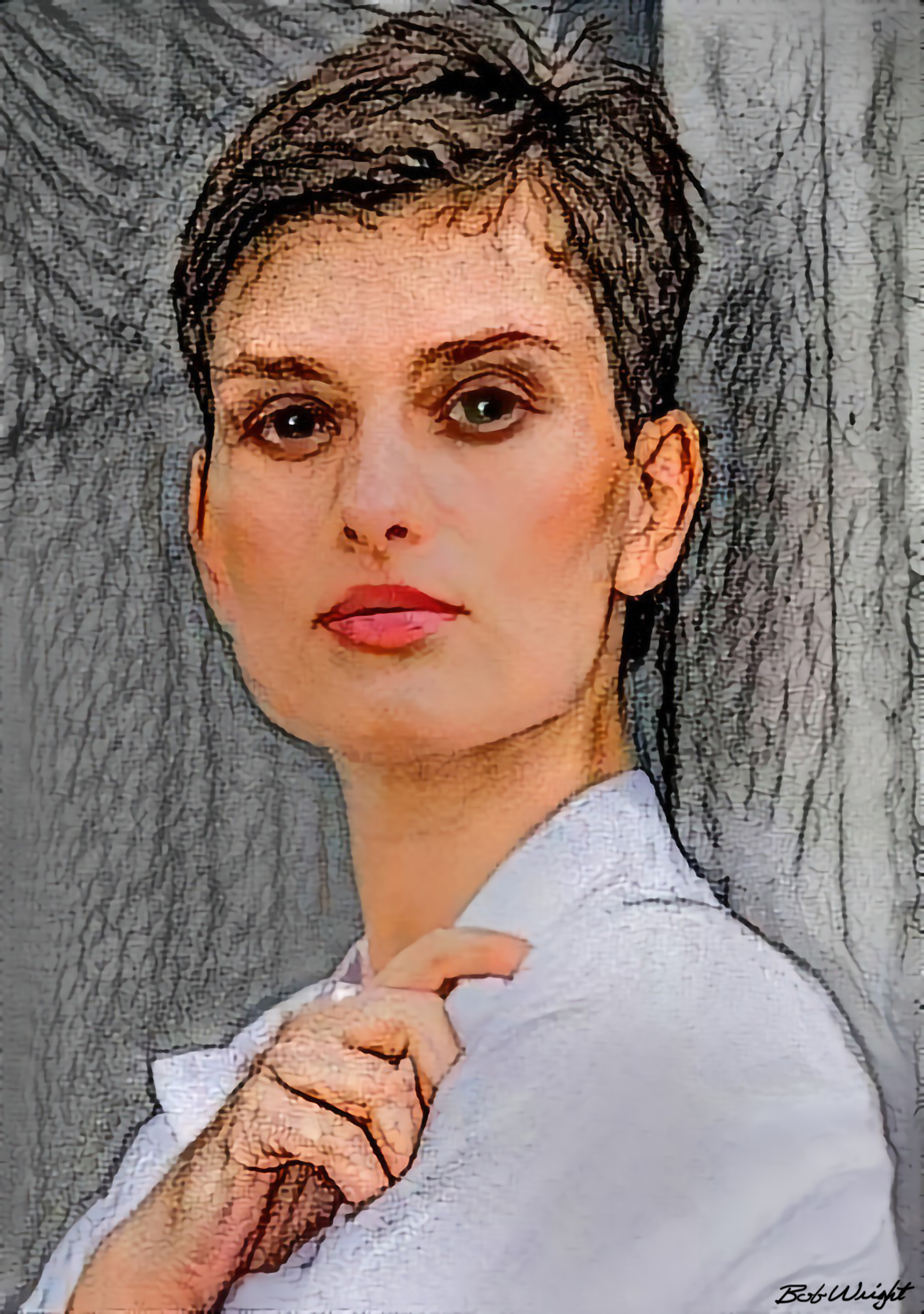
This image is originally 2145 x 2052 pixels.
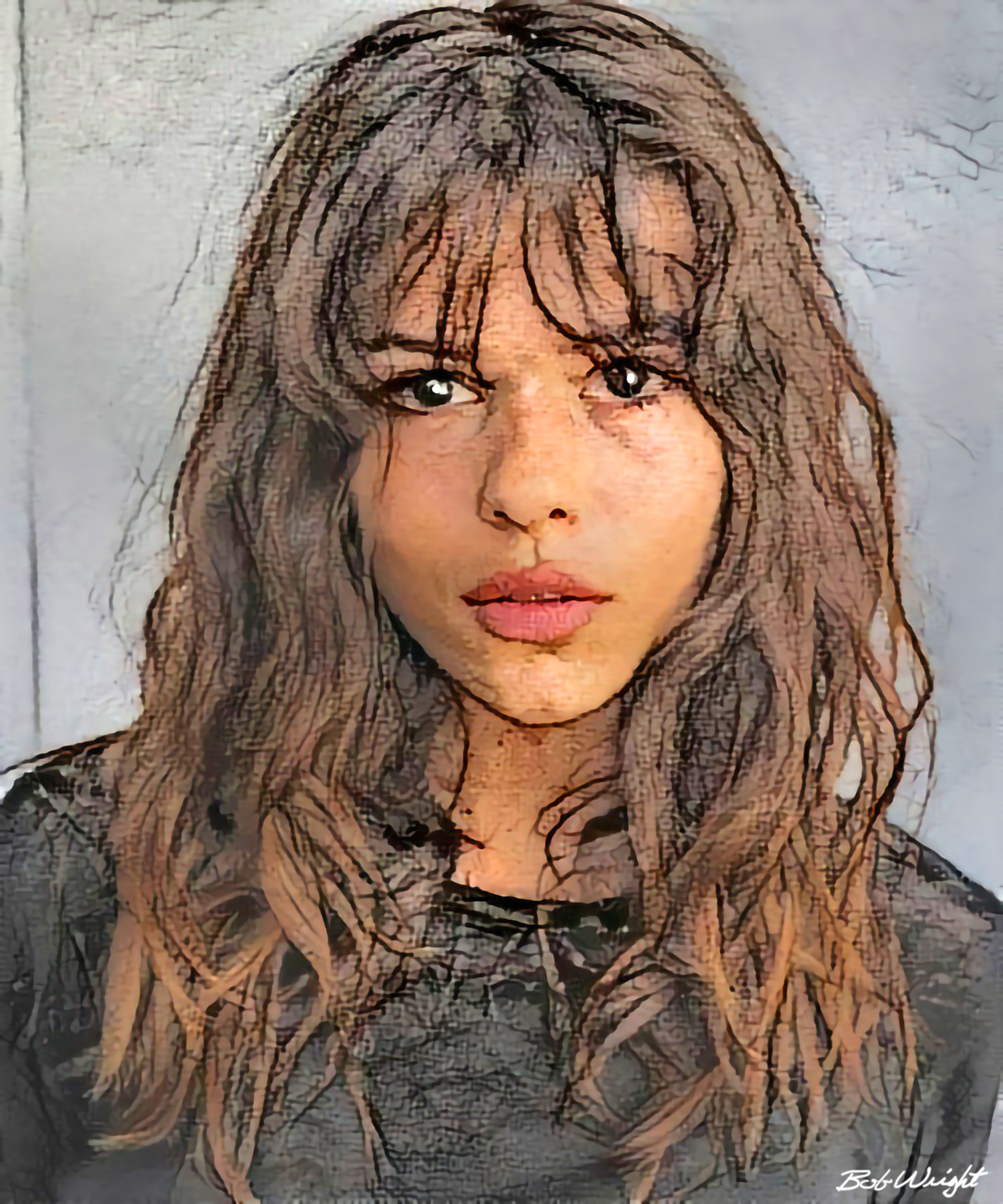
This image is originally 1500 x 1800 pixels.
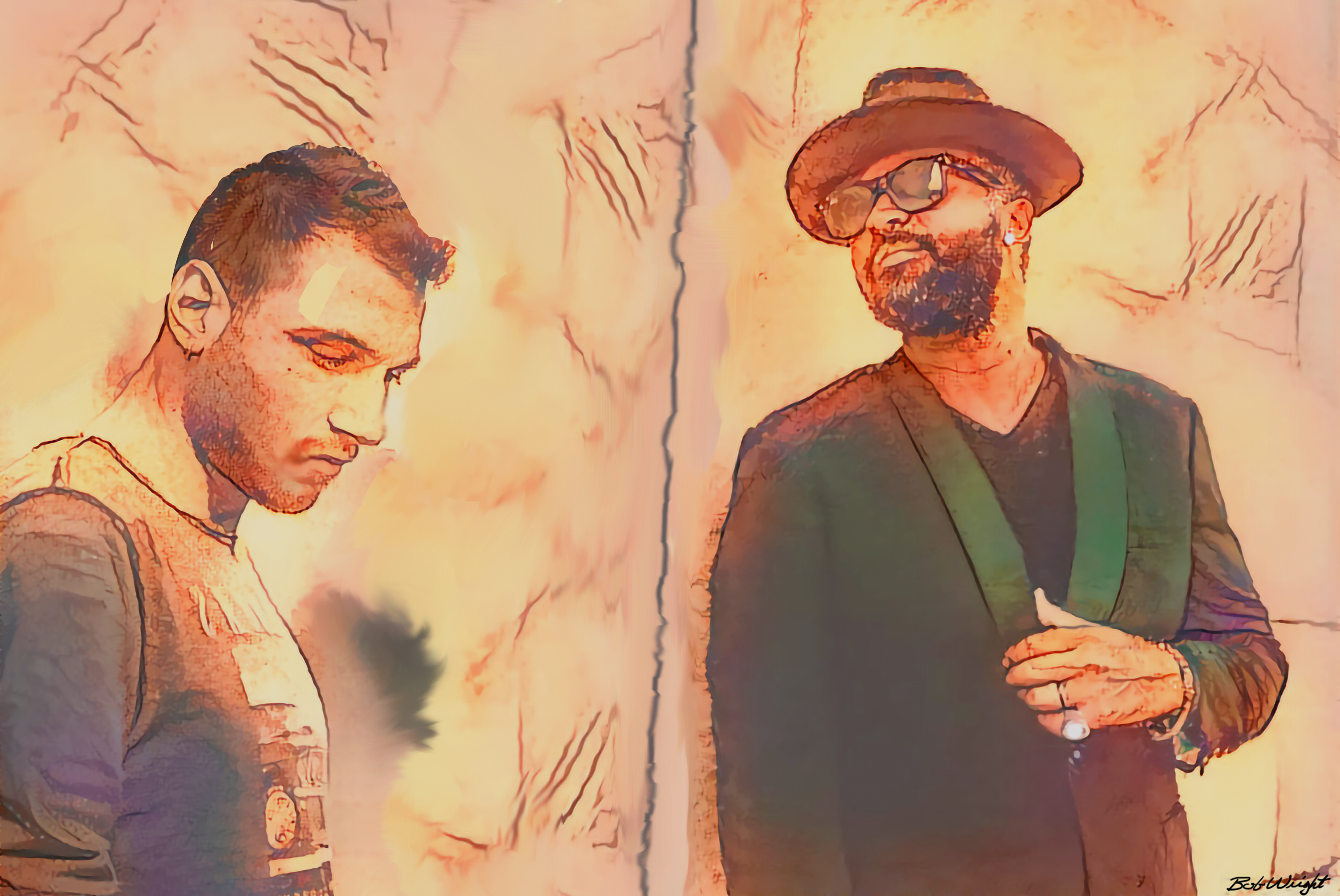
This image is originally 3024 x 2023 pixels.
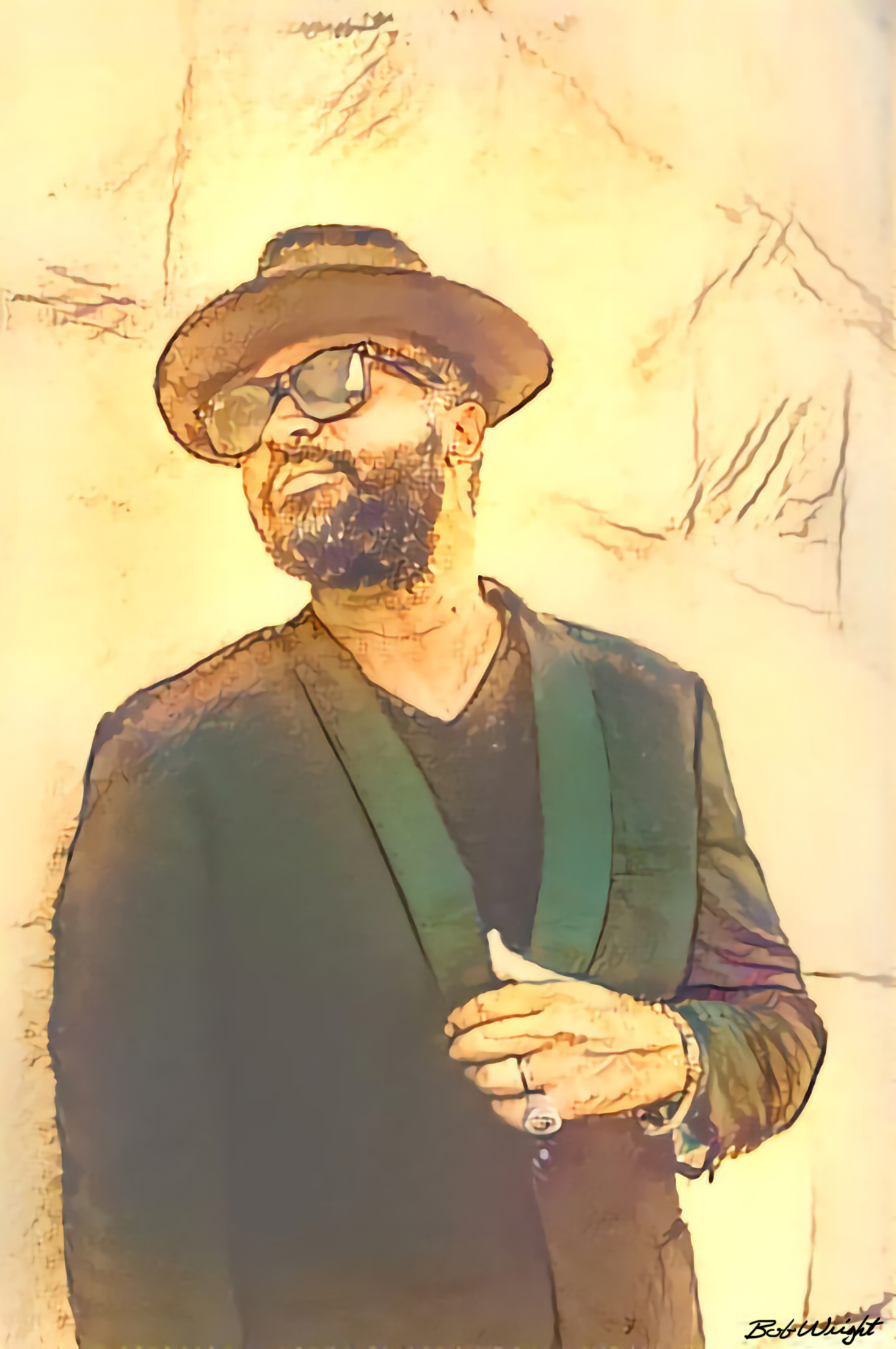
This image is originally 1467 x 2208 pixels.
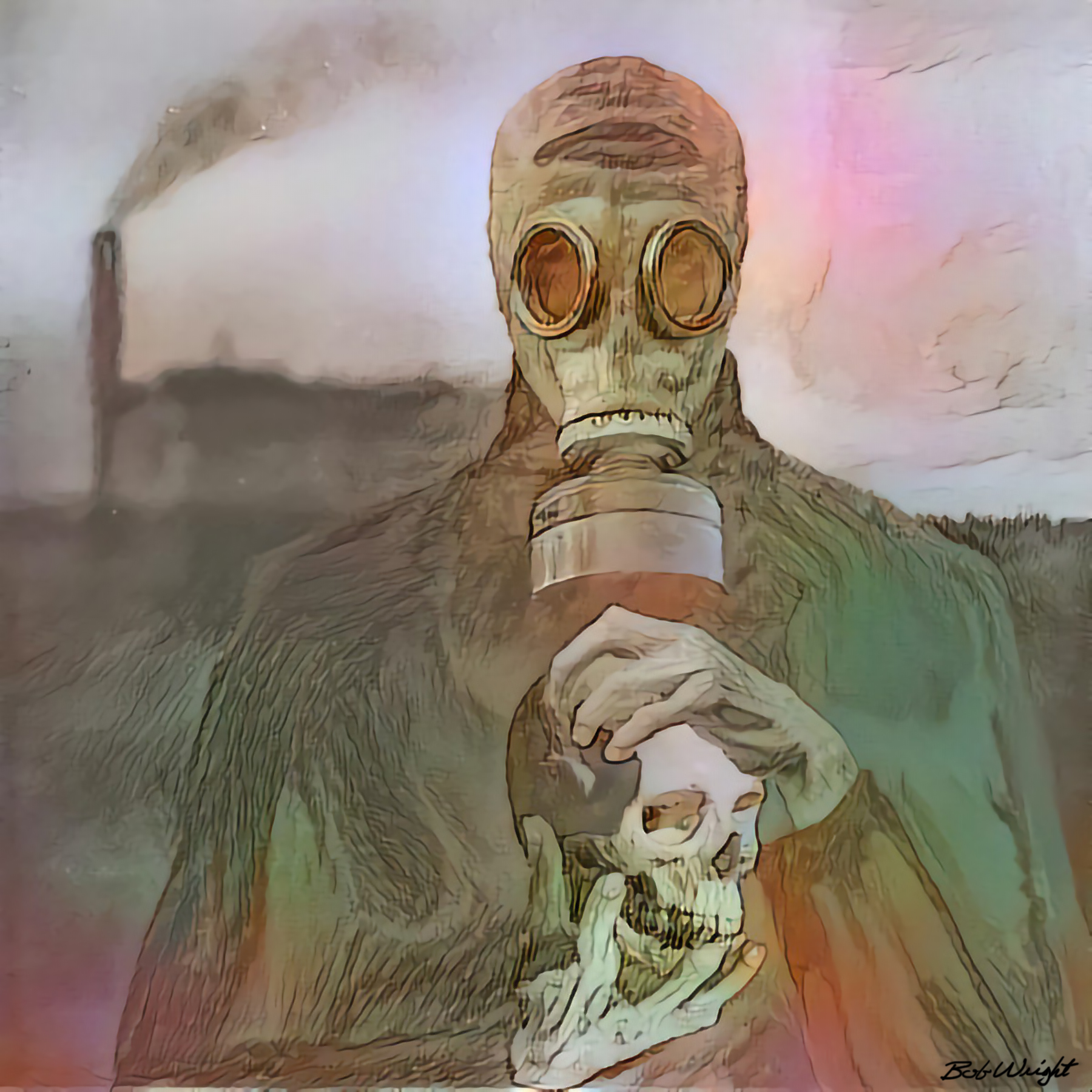
This image is originally 1800 x 1800 pixels.
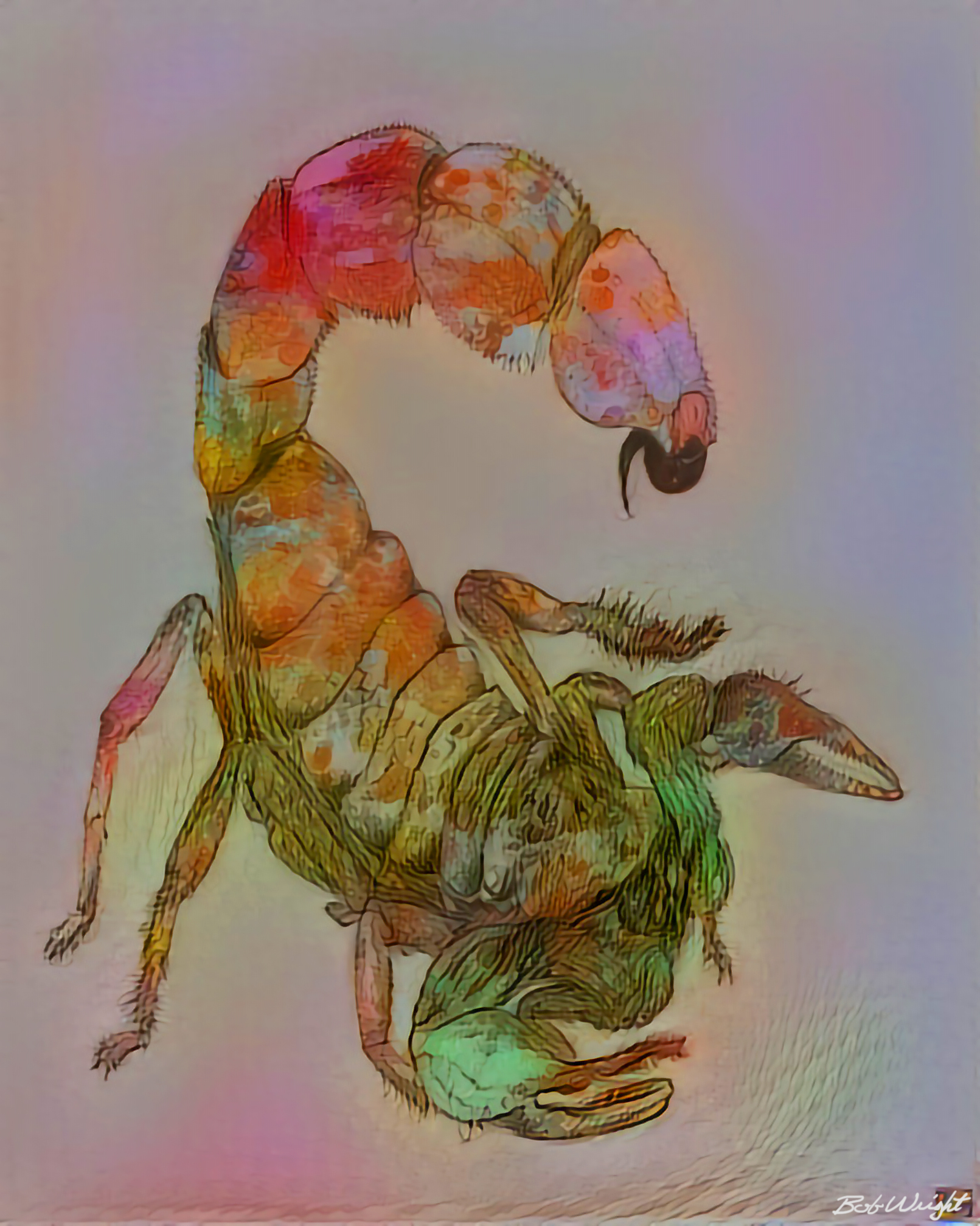
This image is originally 1611 x 2016 pixels.
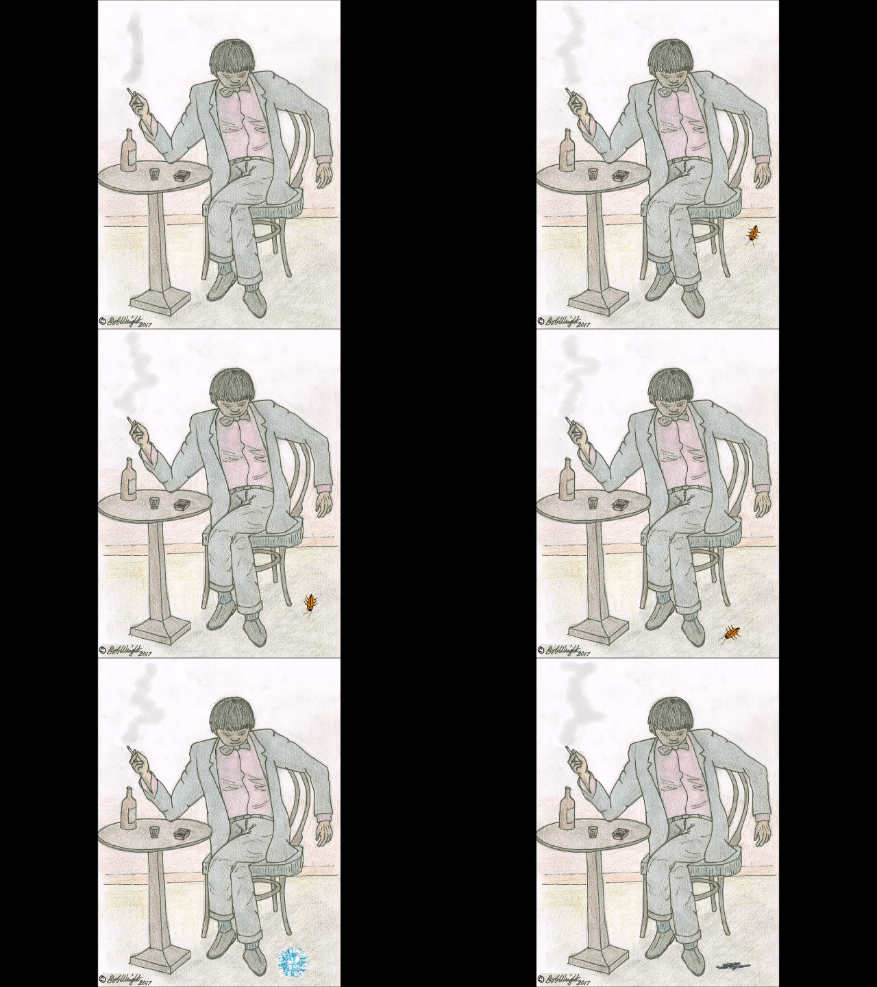
This image is originally 480 x 640 pixels. Aninmated GIFs can be used as content.
This document is a work in progress. It is subject to change.
Now let's go make some comics!